
TheOddtail Website
Web Design & Development
Founder project
A little odd. Built with purpose.
TheOddtail’s own studio website. A founder project, not an external client commission.
01 / The experience
A home for
the work.
A portfolio with room for the work and a clear way to get in touch. TheOddtail’s own identity carries across a responsive website, designed and developed for both project and hiring enquiries.
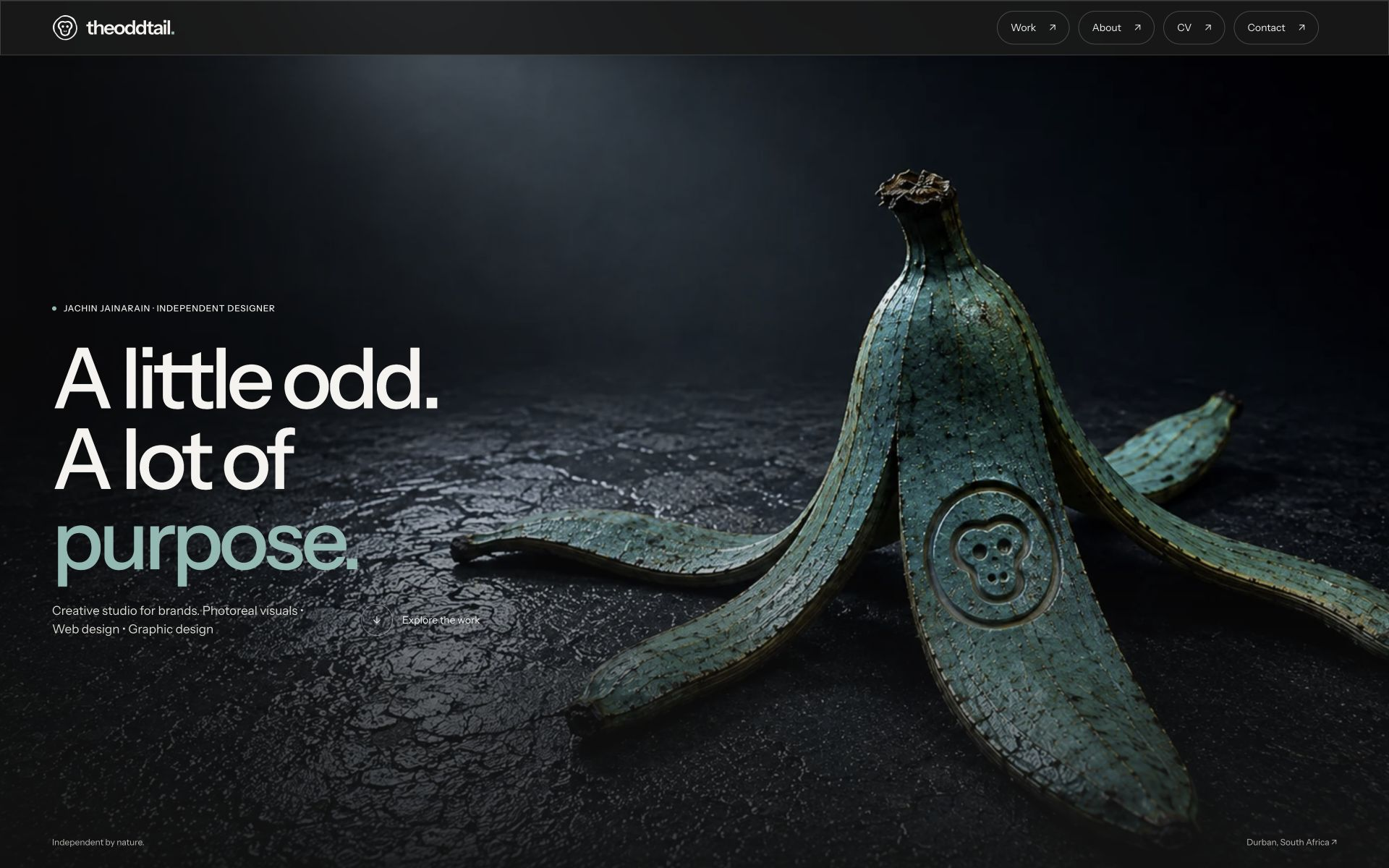
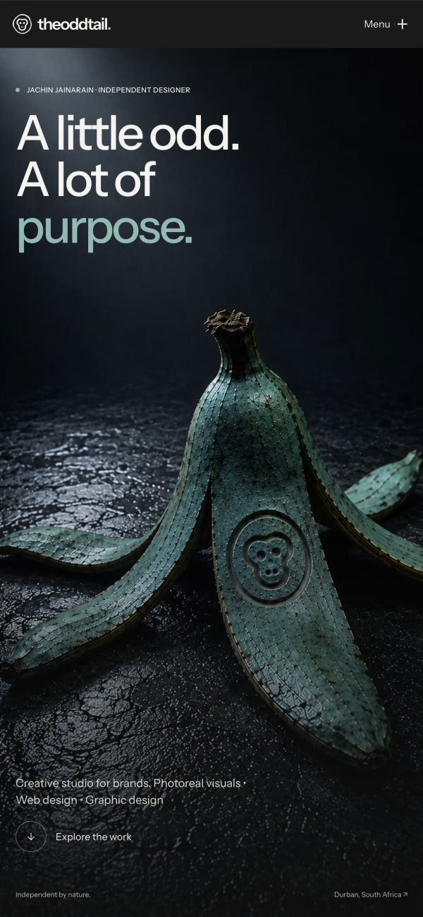
- The brief
- Give the portfolio its own character, without competing with the projects it presents.
- My contribution
- Creative direction, visual identity, responsive web design and development.
- The relationship
- TheOddtail’s own founder project. Not an external client commission.
02 / Visual identity
Colours &
typography.
Instrument Sans is used for headlines and body copy. Charcoal and warm off-white form the base palette, with warm grey surfaces and teal accents.
Instrument Sans
A little odd.
A lot of
purpose.

theoddtail.
Out the Oddinary
The site palette, original emblem and typography, presented in their native form.
03 / Design details
Interaction
design.
Project images settle into place without losing their proportions. Links respond with a rising fill and turning arrow, with keyboard focus and deliberate-tap feedback.
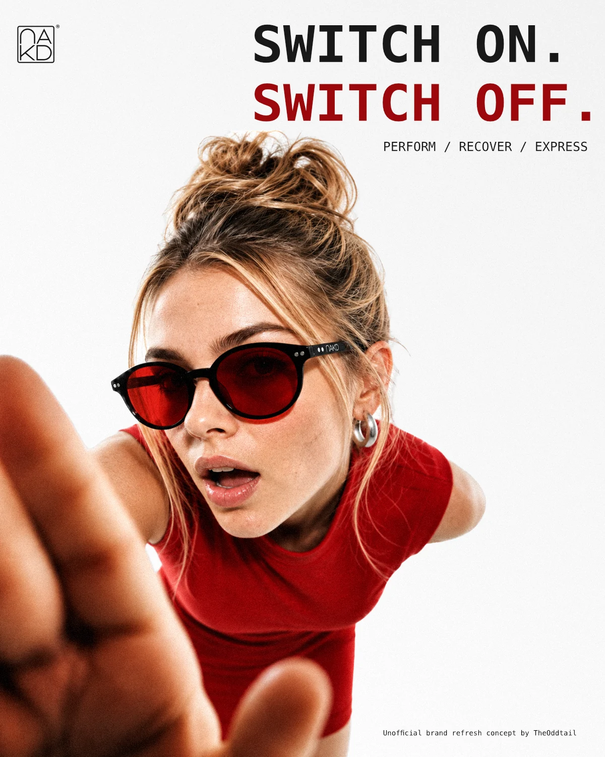
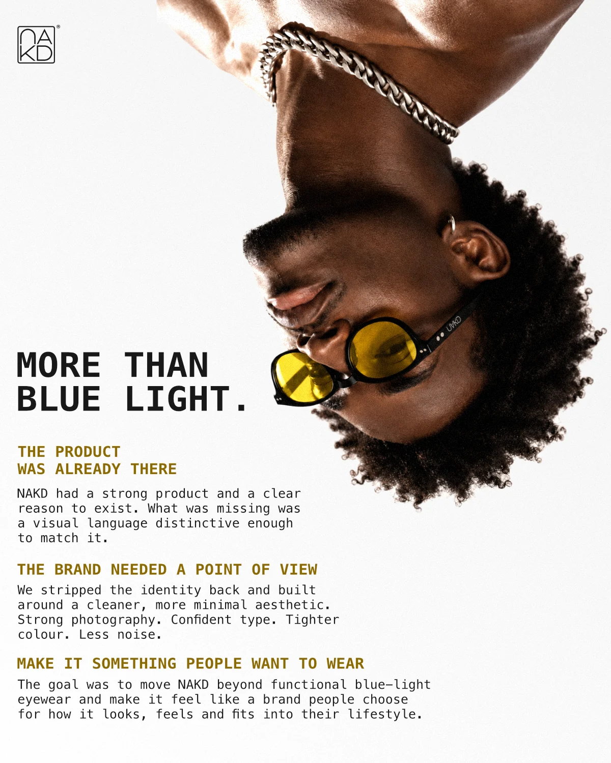
The work keeps its shape.
The paired layout leaves both portraits uncropped. The card itself opens the full case study.
A clear next step.
An ink fill makes the next step visible. The enquiry opens with the project option already selected.
04 / Responsive experience
Recomposed.
Not reduced.
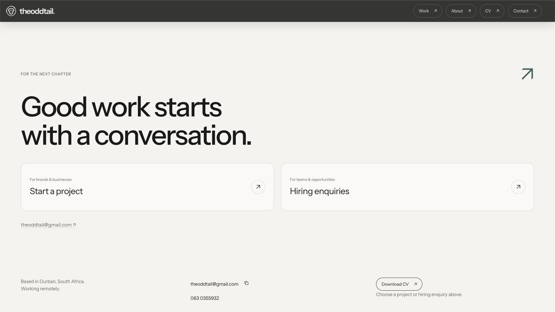
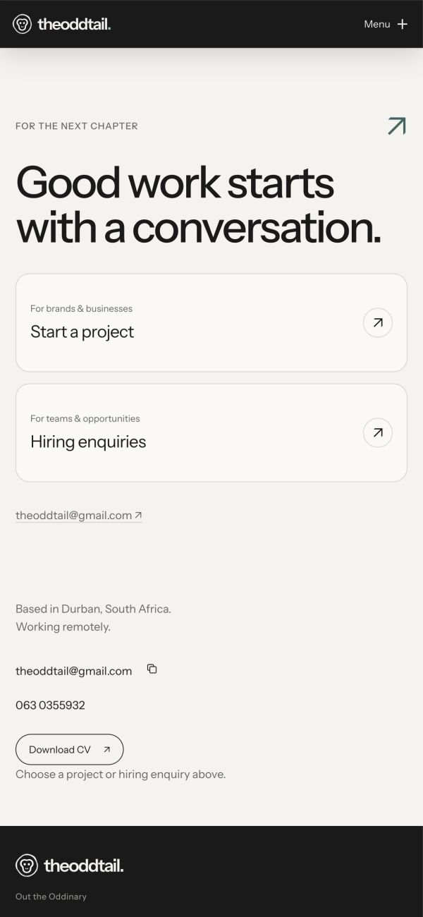
Side-by-side choices become a clear vertical sequence on a phone. Type, image crops and spacing adapt with the layout. The same two enquiry options stay visible, without relying on a hover state.
Navigation within reach
One connected
surface.
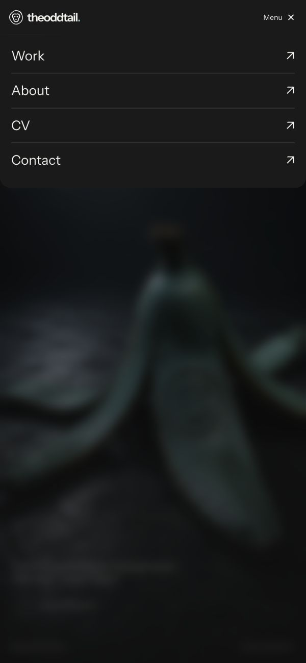
The mobile menu opens from the compact header. Ink rows stay connected to the brand, with the page blurred behind them and a visible close control.
On desktop, the navigation starts as a horizontal bar and contracts as you scroll. Touch feedback waits for a tap, so a scrolling thumb does not trigger a hover fill.
05 / Development
Design, carried
into the build.
The layouts and interactions are implemented in the website itself. Astro and TypeScript provide the page structure; GSAP and ScrollTrigger connect motion to native scrolling.
- 01 Content first
- Shared project data generates static case-study pages. A common card and page structure keep navigation consistent, while each project gets an image composition suited to its work.
- 02 Motion with a baseline
- Headings blur into focus and frames settle as they enter the page. Reduced-motion preferences bypass the scroll timelines. The text, imagery and links remain available without the effects.
- 03 A working contact flow
- Project and hiring enquiries have different fields. A Cloudflare Worker handles submissions, Turnstile checks the request and Resend delivers the email. Direct email and phone details remain available.
Astro · TypeScript · GSAP / ScrollTrigger · Cloudflare Workers
Next in the collection
↗NAKD
Art direction · Campaign concept
View project